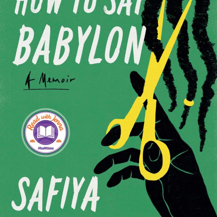
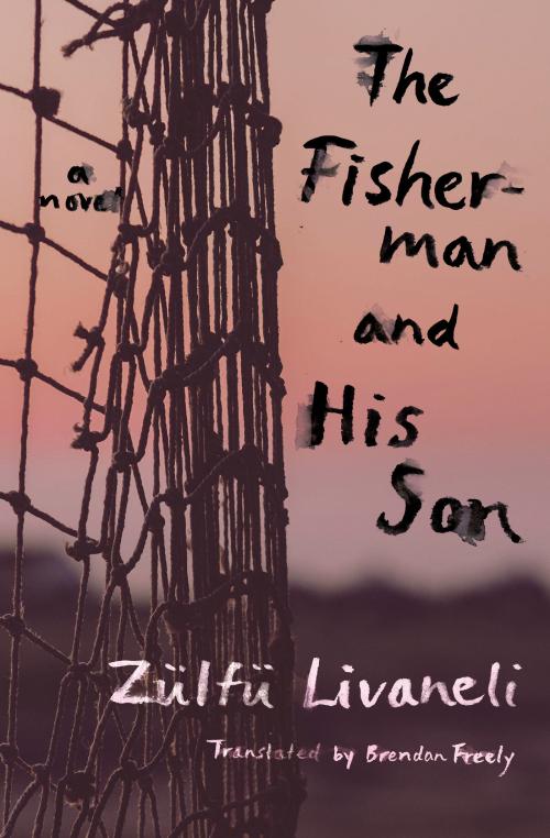
A London-based publisher recently asked me, “How would you compare US and UK book cover designs?”
I had no intelligent answer for him—I’d never taken the time to study the differences—but it got me thinking.
Such a general question can only have a general answer, unless I look at specific books. The Millions, an American online literary website, published a post comparing US and UK book covers, so I’ve decided to write one for Litro too about popular books I’ve read in the last few years. I’ll talk about which ones work better (in my humble opinion), and how I think they promote or take away from the gist of the story. American covers are on the left, British on the right.
The Curious Incident of the Dog in the Night-Time by Mark Haddon


Perhaps the US cover is trying to come across blunt and straightforward like how Christopher, the main character who has Asperger Syndrome, acts with others. I think the UK cover works better as a plug for the main character’s voice because it’s bold, tells the truth without sugar-coating things (the dead dog picture is quite dramatic), and the font gives it a child-like innocence.
My preference: UK
The Kite Runner by Khaled Hosseini


I like how the American cover gives us a kite’s-eye view, the city sprawled underneath, but the font reminds me of a horror movie. The UK cover’s font gives a floating, blown in the wind feel, and the boy pictured lets potential readers know a little bit about the main characters. The pomegranate design at the top is a nice touch, the fruit tree being an important element in the story.
My preference: UK
Peace Like a River by Leif Enger


Although both the rider and goose relate to the story, I think the rider against the hazy blue gives the US cover some mystery. I see it and want to know who the rider is, why he’s alone, where is he going etc. The UK’s goose makes sense after you read the story, but it doesn’t invoke as much curiosity.
My preference: US
The Reason for God by Timothy Keller


My first reaction to the US blank white cover was exactly that – blank. I had nothing much to say about it until I thought about what many people think when they hear the word “God”: nothing. If you’re an agnostic, perhaps the mention of God brings thoughts of a blank, far-off void, vast nothingness, home of the unknown. As for the UK cover, I like how it seems you’re looking up at the stars, a favourite pastime of mine which, although difficult to do in London, always brings my thoughts toward God. Stargazing easily turns the shallowest beings into philosophers and theologians.
My preference: Both (cop-out?)
Salmon Fishing in the Yemen by Paul Torday


People facing away seem to be common. The US cover does this, telling us a little about a character but not so much. We’re given no clues about his emotions or if life has deepened the lines on his forehead. I like the arcs on the UK cover – how the title squashed and bent in the corner and the author’s name curved below mimic what the fish are doing, twisting as they jump. The UK font is perfect; the US one is a little too neat.
My preference: UK
If you can think of specific books with strikingly different US and UK covers, I’d love to hear your comments.
Emily Cleaver
Emily Cleaver is Litro's Online Editor. She is passionate about short stories and writes, reads and reviews them. Her own stories have been published in the London Lies anthology from Arachne Press, Paraxis, .Cent, The Mechanics’ Institute Review, One Eye Grey, and Smoke magazines, performed to audiences at Liars League, Stand Up Tragedy, WritLOUD, Tales of the Decongested and Spark London and broadcasted on Resonance FM and Pagan Radio. As a former manager of one of London’s oldest second-hand bookshops, she also blogs about old and obscure books. You can read her tiny true dramas about working in a secondhand bookshop at smallplays.com and see more of her writing at emilycleaver.net.
book covers book design transatlantic


I love looking at the differences. One of my favorites is Kazuo Ishiguro’s Nocturnes: Five Stories of Music and Nightfall.
That’s a good example too. Which version do you prefer?
I think the US cloth cover of Nocturnes was bluer before it rained on it. I liked it very well until I saw the dancers in the night-lit garden of the UK version.
I also like the UK (hardcover) version of Jayne Anne Phillips’ Lark and Termite, but the US hardcover version of Vanessa Gebbie’ The Coward’s Tale.