You have no items in your cart. Want to get some nice things?
Go shopping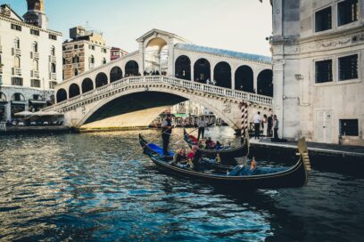
If we arrange to meet in Venice, where would you suggest? Outside St Mark’s Cathedral might seem the obvious place, but hectic and not very relaxing with crowds of tourists in constant motion. Outside the fascist front of the railway station? Convenient, perhaps, but once again, swarms of visitors arriving and leaving, and not very atmospheric. Which leaves the Rialto Bridge, heart of the city’s activity, where we can lean out and watch gondolas, motor launches, and barges pass beneath on the Grand Canal. Although a great many people are crossing the bridge, they aren’t all tourists, and a lot of those, like us, are standing still soaking in the ambience.
The Rialto Bridge, then. The Riva Alto, ‘high bank’, the oldest part of the city where refugees from the crumbling Roman empire hammered in poplar stakes to reclaim a marsh. Perhaps the most evocative symbol of Venice. So familiar we hardly question it as an icon. But let us stand back down beside the canal—on the Riva del Vin, say, near the church of San Silvestro—and assess the bridge in terms of design. How does it measure up?
The sloping rows of arches are what we notice first. They’re set back from the balustrade of the walkway and have an air of not belonging to the bridge structure itself. The balustrade, with its rows of stone balusters and small brackets, is heavily patterned. The plainness of the arches is a stylistic mismatch. The arches of the Ponte Vecchio in Florence are, to me, much more satisfying. The columns supporting the arches grow naturally out of the parapet edging the walkway, which in turn grows out of the bridge structure beneath, all in the same dark stone.
To further the comparison: at the springing points of the arches of the Ponte Vecchio there’s a change of material from stone to plaster, celebrated by modest column heads. The Rialto arches are bland cutouts from unexceptional stonework. They look like one of those printed lengths of pattern provided for collage, snipped to length and too long to be lacking punctuation. The Ponte Vecchio arches have a clear formal relationship with the curve of the span below. The Rialto Bridge arches have none. Also I long to see, in the areas of blank wall between the heads of the arches, glazed terra cotta medallions like those by Andrea della Robbia on the Ospedale degli Innocenti in Florence.
And the skyline? It would be unfair to compare the straight edge of the Rialto Bridge roof with the fishtailed Ghibbelline merlons and crenels of the Ponte Scaligero in Verona. The Ponte Scaligero is part of a large defensive structure. But I love the way those battlements reach up to embrace the clouds. The bland roof of the Rialto Bridge ignores the sky. One could say the roof of the Ponte Vecchio is bland, but that bridge, with its outgrowth of homes, is more domestic than civic despite its fame. The Rialto Bridge is nothing if not civic. It ought, if not to embrace the sky, at least shake hands with it.
If the long sloping roofs don’t do that, surely the central feature should. But its pitched roof also ignores the sky, and its eaves relate awkwardly to the curves of the long roofs. To me this feature is just another piece of collage which bears little relation to the rest, either in its style or its abrupt juxtaposition. In musical terms, its relation to the long rows of arches is like a key change without common-chord modulation. And a final comment on this part of the bridge: to me the stonework above the centre of the main span doesn’t look deep enough.
And yet—the Rialto Bridge is an icon. Seen lit at night against darkness it seems magical, like fairy lace. You think, Ah! How can this be, despite all my strictures?
I think when an image is seen over and over there’s a brainwashing effect. Familiarity trumps criticism. To be reproduced so often on brochures and souvenirs, to be a magnet for tourists, to somehow be Venice, the bridge must surely be something fine? There’s a parallel in the field of graphic design. Many corporate logos are excellent, but many are clunky and ill-balanced, yet the constant repetition of the latter can hypnotise our perception. (The clumsy logo for the 2012 London Olympics is a good example.)
So my censure is unwelcome. I’m like the fastidious diner who undermines the enjoyment of his companions by saying the sauce is a soupçon too rich or the green beans just a little too limp. Most visitors to Venice love the Rialto Bridge. Though I sympathise with one who said it was overcrowded with tourists, boats, and surrounding shops, and hence not romantic.
If I invite you to rendezvous there I’ll suggest the quiet of the night, when we see it lit up like fairy lace, insubstantial.
By AlexBarr


